Photographed on the balcony of his apartment in France, a birthday gift for my friend David Luraschi, director of “Penny Girl” by Cola Boyy. Previously featured in my blog as an art project with a great built-in deadline to inspire you (a friend’s birthday), this collage on a cradled birch panel is a nice format I’ve been returning to, which lends itself to mixed media application and weightier craft.
art
"I wish I knew."
Birthdays make the best deadlines
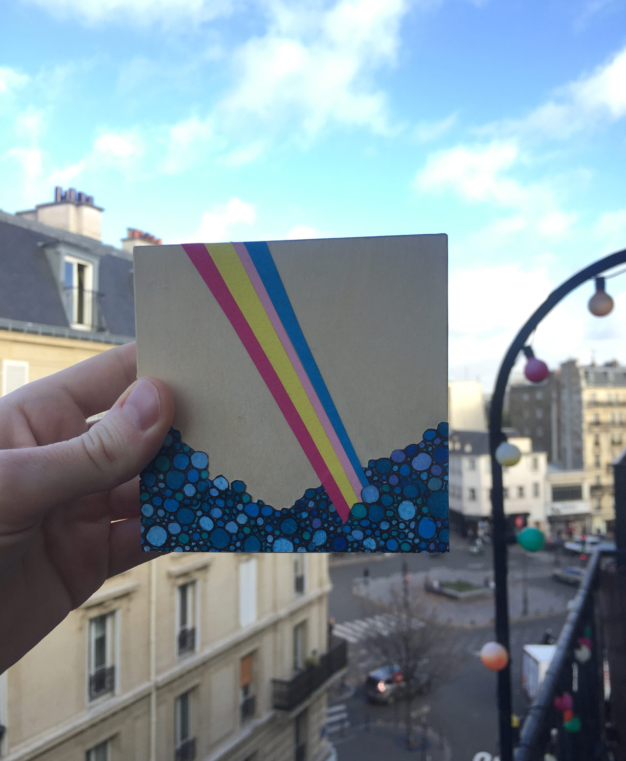
For a handful of mornings in late-October, I’d rise before work and whittle away at this gift, chattering crows on the other side of my kitchenette window. After awhile, a second skin of super glue dried on my right thumb and index finger, smudged with the wax residue of colored pencil illustrations I pressed onto the panel’s surface. Before wrapping it up, I could see that I’d left a fingerprint along the panel's edge, a faint “hello” to the friend I was making it for. I wondered if he’d notice. If you’re an artist, and wanting to strengthen your skills of accountability when it comes to delivering an original piece by a specific deadline, I can’t recommend other friends’ birthdays any higher. The wreckage of my latest collage (see above) was strewn with love for one of my dearest friends, a opportunity to test out some new approaches for an audience of one. Everyone has the ability to create things with their hands & heart, and for my money, nothing beats receiving a gift in the mail that only you know could've come from someone you love. After all, it has your fingerprints all over it.
"Tuba" for USC Thornton School of Music
Design for USC Thornton School of Music, showcasing their tuba faculty’s October recital. Accidentally deleting its black outline was a happy accident, giving it a sense of weightlessness and breezy fun I was more than happy to keep!
"Instagram Buddies" Trading Cards: Series #1
Serving as both a fun project and a locomotion behind building stronger habits for practicing faces, I’ve decided to create multiple series of trading cards (4 inches x 3 inches) based on the Instagram selfies/photos of my friends. I find that, whenever confined to a smaller space than usual, my senses of what feels right when portraying the character of a face, sharpen. On a card, for example. Here’s to hoping I can finish enough of these to line the molding that runs along my apartment’s walls, just beneath the ceiling. How’s that for a benchmark?
red_meow
(Tiny) Taco Tuesday
I'd like to develop the habit of drawing or creating something quick immediately after waking up and having my morning tea. Today (Tuesday) was my first attempt at this: a tiny paper taco. I crafted this tasty snack, all the while completely forgetting about my cup of Earl Gray, which was cold to the touch when I went to pick it up soon after. A small price to pay for getting lost in one's work.
ALGORITHM
Self portrait
"Here's Lookin' At You;" (Spider Eyes)
Same
Back in the studio
What a joy to create this bright new color combination for my latest miniature, a recording studio from the mid-1960s. Partly historical, partly fantastical, this set was designed for my latest film, a documentary which utilizes archival recordings from the same era. I've always gravitated towards bending the rules of visually representing the past, and hope all of these pieces I've gathered come together as neatly as craft wood; Albeit, with some of their most endearing human imperfections imprinted upon the final product.
AmirSaysNothing
I had the good fortune to catch AmirSaysNothing at a concert showcase organized by the prolific Charlie Scovill, held at the Bootleg Theatre in Los Angeles earlier last month. Amir's blistering set featured selections from his most recent collaboration with Scovill, Love Always, Mr. Right, which promptly made me an instant fan; Hence, this fan art. For more music from this electric pair and many more artists produced under Scovill's unique vision, please visit www.charliescovill.com to catch just a glimpse of this wunderkind's prodigious output.
Erin
Hand lettering cinematic titles & an appreciation for Pablo Ferro
One of my all-time favorite movie openings that elegantly incorporates hand lettered cinematic titles belongs to Jonathan Demme's Philadelphia. Masterfully pairing the film's theme (performed by Bruce Springsteen) with warm, cursive script, this sequence beautifully captures the shifting harmonies and subtle cruelties of an American city, one which claims brotherhood as its namesake (or brand), rather than an embodied ideal to strive for.
Even as a young child, I appreciated the feeling that came over me as I recognized titles on screen that weren't rigid and streamlined. Like in Philadelphia, these were deliberate, yet imperfect artistic choices. Handmade, preserving all their flaws. Their inclusion almost seemed like a clever trick, as if each card was an intruder, too sloppy for the big screen. Yet every time I'd come across this artist's work, whether I knew it or not, he evoked notes that I still can't describe. Going back through his resume, it's illuminating to realize his craft framed some of my favorite films as a child, my most formative to how I approach titles today: Dr. Strangelove, Harold and Maude, Men in Black & The Addams Family.
I'm speaking of the great Pablo Ferro, whose unmistakable style is still as bold and fresh as it was right off the page in the mid-60s. As I've learned, in creating my own handmade titles for my upcoming film, this approach takes time and a great deal of patience, much like re-fueling a B-52 in midair. Starting with a ruler, paper and some technical pens, I've reconnected with that childlike fascination of the bond between the hand and the page, an artistic choice that is imprinted with as much care as setting up a shot or smoothing out a piece of audio. Every bit counts.
Miniature-in-progress: Recording studio
My latest film incorporates a new miniature set, a recording studio, which I'm realizing seems to borrow (in spirit) from the color palette of Stanley Kubrick's creepy red bathroom in The Shining. Eagle-eyed fans of The Duel may notice the grey file cabinet from its hospital scene, which will be repurposed for this new work with a coat of flamingo paint. Stay tuned for more mini updates as this room comes together!
Empty Skies // official poster
What a stimulating challenge to design a film poster for another filmmaker's vision! Many thanks to directors Wenting Deng Fisher & Luke Fisher for their guidance and faith in my abilities. The sumptuously shot and heartbreaking short, Empty Skies, coming soon!
Feathers
Not falling asleep by your usual bedtime is a bit like missing your bus home when it's really late at night. All you can do is wait until you're tired again. By that time, opportunities for sleep (much like the buses) only come about an hour or so apart. That is, if they're still running at all. So you just have to lie there and wait until the feeling takes you again. Perhaps you try to busy your mind, tricking it into thinking it's more tired than it really is: "Draw some feathers," you command. "Now open Photoshop." And you do. And still, you wait. Because you already missed your bus.
"Mommie Dearest" Criterion Collection concept art
Learn to love yourself / Before loving someone else
Last year, I began compiling a sticky note on my desktop - a list of ideas for drawings that I've been meaning to complete. The above, "Learn to love yourself before loving someone else," is my first crack at the list. More to come, as I keep chipping away.