
One of my all-time favorite movie openings that elegantly incorporates hand lettered cinematic titles belongs to Jonathan Demme's Philadelphia. Masterfully pairing the film's theme (performed by Bruce Springsteen) with warm, cursive script, this sequence beautifully captures the shifting harmonies and subtle cruelties of an American city, one which claims brotherhood as its namesake (or brand), rather than an embodied ideal to strive for.
Even as a young child, I appreciated the feeling that came over me as I recognized titles on screen that weren't rigid and streamlined. Like in Philadelphia, these were deliberate, yet imperfect artistic choices. Handmade, preserving all their flaws. Their inclusion almost seemed like a clever trick, as if each card was an intruder, too sloppy for the big screen. Yet every time I'd come across this artist's work, whether I knew it or not, he evoked notes that I still can't describe. Going back through his resume, it's illuminating to realize his craft framed some of my favorite films as a child, my most formative to how I approach titles today: Dr. Strangelove, Harold and Maude, Men in Black & The Addams Family.

One of Pablo Ferro's most iconic works, his diabolically romantic opening titles for Stanley Kubrick's Dr. Strangelove, or: How I Learned to Stop Worrying and Love the Bomb.
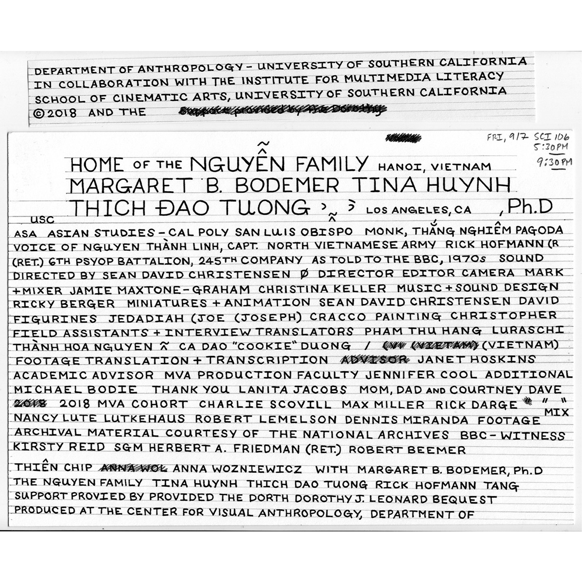
I'm speaking of the great Pablo Ferro, whose unmistakable style is still as bold and fresh as it was right off the page in the mid-60s. As I've learned, in creating my own handmade titles for my upcoming film, this approach takes time and a great deal of patience, much like re-fueling a B-52 in midair. Starting with a ruler, paper and some technical pens, I've reconnected with that childlike fascination of the bond between the hand and the page, an artistic choice that is imprinted with as much care as setting up a shot or smoothing out a piece of audio. Every bit counts.
